Best Caption Styles for Shorts, Reels & TikTok (2026)
The best caption styles for shorts, decided fast: side-by-side font, weight, color, outline and word-highlight examples, copy-paste safe-zone specs.
By the Recapo.ai Editorial Team · Fact-checked July 10, 2026
The best caption styles for shorts aren't a matter of taste — they're close to a solved problem, and the solution is almost boringly consistent across every viral clip you've scrolled past: bold white sans-serif text, a thin dark outline, two to five words on screen at a time, centered in the lower-middle safe zone. This guide turns that consensus into a decision you can execute in minutes: side-by-side options for font, weight, color, outline, and word-by-word highlighting, plus copy-paste safe-zone specs for TikTok, Reels, and Shorts — then how to apply your pick with a style editor instead of hand-nudging every line. Whether you're after a youtube shorts caption style that reads at arm's length or a tiktok caption style that survives the app's cluttered UI, the winning move is the same: standardize one readable, on-brand look and reuse it on every video.
So this isn't a mood board. It's a set of levers — font, weight, color, outline, motion, and position — with a recommended default for each and the exact reason it wins. Pick a value for every lever once, save it as a preset, and you never make this decision manually again.
What the best caption styles for shorts have in common
Before the options, understand why the consensus exists. Captions on short-form video are a retention decision, not a design flourish. Feeds autoplay muted, viewers watch on small phone screens in motion, and you have about a second to prove the clip is worth staying on. A caption style "wins" when it's legible at a glance over any background, with the sound off — everything below serves that one goal.
That's why the same recipe keeps surfacing on the clips that travel. Here's the proven baseline — the safe default before you add any personality:
| Lever | Proven default | Why it wins |
|---|---|---|
| Font | Bold sans-serif | No serifs to blur at small sizes; heavy strokes hold up over busy footage |
| Weight | Bold to extra-bold | Thin text disappears against motion; weight is legibility |
| Case | Sentence case or ALL CAPS in short bursts | Caps read loud but tire fast in long lines |
| Color | White fill | Highest contrast against the widest range of footage |
| Outline / shadow | Thin dark stroke, subtle shadow | Separates text from the background on light scenes |
| Words on screen | 2–5 at a time | One phrase per beat matches how people read while scrolling |
| Position | Lower-middle, inside the safe zone | Below the action but clear of platform UI |
| Motion | Optional word-by-word highlight | Directs the eye and paces the read; skip it for calm content |
Treat this as your starting point, not a cage. The move is to keep the readability fundamentals (weight, contrast, outline, safe zone) fixed and express your brand through the two levers that carry personality without hurting legibility: font choice and highlight color.
Font and weight: the best subtitle font for shorts
The best subtitle font for shorts is almost always a bold sans-serif — the debate is only which flavor. Serif and script fonts have thin strokes and fine details that smear at phone size over moving footage, so they're out for burned-in captions. Within sans-serif, the family you pick sets the personality. Here's the trade-off, with common examples you can actually try:
| Font style | Feel | Best for | Watch out for |
|---|---|---|---|
| Geometric sans (e.g. Poppins, Montserrat) | Clean, modern, friendly | Lifestyle, education, product, faceless explainers | Can feel generic if left at default color |
| Neo-grotesque sans (e.g. Helvetica, Inter) | Neutral, professional, trustworthy | News, finance, B2B, documentary-style | Slightly quieter; lean on weight and highlight |
| Rounded sans (e.g. Nunito, Baloo) | Warm, playful, approachable | Comedy, kids, pets, casual vlogs | Too soft for authority or hard-news topics |
| Condensed / heavy display (e.g. Anton, Oswald) | Loud, punchy, "hook" energy | Sports, hype edits, reaction, big claims | Cramped in long phrases; keep lines short |
Two rules keep you out of trouble. First, weight beats size: an extra-bold word at a medium size reads better than a thin word at a huge size, because the stroke thickness — not the height — is what survives compression and motion. Second, one font per channel. Consistency is brand; switching fonts every video costs you recognition and adds a decision you don't need. Pick one family that fits your niche, lock the weight at bold or heavier, and move on.
Color, outline, and background: the readability stack
Contrast is what makes captions readable, and you build it in layers so the text never blends into the footage — no matter what's behind it in any given frame. Think of it as a stack you can dial up or down:
| Layer | Options | When to use |
|---|---|---|
| Fill color | White (default); brand color for the highlighted word only | White for the body; save color for emphasis, not whole lines |
| Outline (stroke) | Thin black stroke, 3–6px at 1080×1920 | Almost always — it's the cheapest legibility you can buy |
| Shadow | Soft drop shadow behind the text | Extra separation over bright or cluttered scenes |
| Background plate | Semi-transparent box or full pill behind the words | Busy footage where outline alone isn't enough |
A few honest guardrails. Keep body text white — colored fills across a whole caption cut contrast on unpredictable backgrounds; if you want brand color, apply it to a single highlighted keyword, not the sentence. Reach for a background plate only when the footage is too busy for an outline to save you — a solid plate is the most readable but least "native" look, trading style for guaranteed clarity. And never rely on color alone to carry meaning, since some of your audience watches in bright sunlight or with color-vision differences; the outline and weight have to do the heavy lifting. Get your stack reading cleanly over your worst-case background and it reads everywhere.
Word-by-word highlighting: the viral caption style, used right
The most recognizable viral caption style is active word highlighting — captions where each word "pops" (changes color, scales up, or gets a plate) exactly as it's spoken, karaoke-style. It works because it does two jobs at once: it paces the viewer's read to match the audio, and it keeps the eye pinned to the text through a whole sentence instead of letting it wander. For fast, punchy, spoken-word content, it genuinely lifts retention.
But it's a tool, not a law. Use this quick test before you switch it on:
- Use word-by-word highlighting when the audio is dense and fast (talking-head, podcast clips, hype edits, faceless explainers) and every line carries a hook.
- Skip it when the pace is slow and atmospheric (cinematic B-roll, calm tutorials, ASMR, moody storytelling) — the motion fights the mood and reads as cheap.
- Keep the highlight subtle: one accent color or a small scale bump. Rainbow, jittery, or oversized highlights read as spammy and age badly.
If you want the mechanics of building these — timing, accent color, and the animation curve that reads as smooth rather than twitchy — our guide on how to add animated captions walks through it. The style earns its reputation only when the highlight is tight and tasteful; done loud, it's the fastest way to look like every low-effort clip in the feed.
Caption safe zones: copy-paste specs for TikTok, Reels, and Shorts
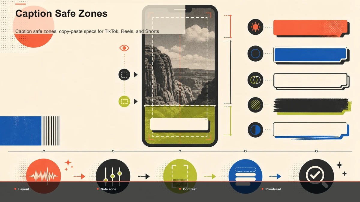
A perfect style is wasted if the platform UI covers it. Every vertical app stacks its own buttons, captions, and username over your video, so the caption safe zone is the region that stays visible on all of them. These are conservative rules of thumb on a standard 1080×1920 vertical canvas — not official platform figures, which shift with every app update — so treat them as a starting box and always preview on a real phone with the app UI on top.
| Region | Keep clear (share of frame) | At 1080×1920 | Why |
|---|---|---|---|
| Top | Top ~10% | ~190px | Feed tabs and status bar |
| Bottom | Bottom ~18–20% | ~360–380px | Username, caption text, progress bar |
| Right edge | Right ~12% | ~130px | Like / comment / share action rail (TikTok, Reels) |
| Left/right margins | ~5% each side | ~54px | Breathing room so text isn't edge-to-edge |
That leaves a reliable caption zone: horizontally centered, within the middle ~80% of the width, and vertically roughly between 50% and 78% of the height — the lower-middle band that sits below the action but above the platform's own text. Center-align captions there and they clear the action rail without you insetting from the right. If you cross-post the same clip to all three platforms, design for the strictest overlap (leave the right rail and the bottom fifth clear) so one export is safe everywhere — a single 9:16 (1080×1920) canvas covers all three.
Match the style to your content
The fundamentals stay fixed; the personality levers should match your niche. Use this as a starting preset per content type, then tune one variable at a time:
| Content type | Font style | Highlight | Position | Notes |
|---|---|---|---|---|
| Talking-head / education | Geometric or neo-grotesque | Subtle word-by-word | Lower-middle | Prioritize legibility; let the words lead |
| Podcast / interview clips | Neo-grotesque | Word-by-word, one accent color | Lower-middle | Speaker name label optional; keep it clean |
| Hype / sports / reaction | Condensed heavy display | Bold color pop | Center or lower-middle | Short lines only; weight carries the energy |
| Comedy / casual vlog | Rounded sans | Playful but subtle | Lower-middle | Warmth over polish; don't over-animate |
| Faceless / documentary | Neo-grotesque or geometric | Minimal or none | Lower-middle | Calm, authoritative; let footage breathe |
| Product / tutorial | Geometric sans | Highlight key terms only | Lower-middle | Emphasize the term that matters per step |
The meta-rule: consistency beats novelty. Pick the row that fits you, save it as one reusable preset, and resist redesigning per video. Viewers recognize a channel by its caption look faster than by its logo — a stable style is free brand equity.
How to apply a caption style in minutes
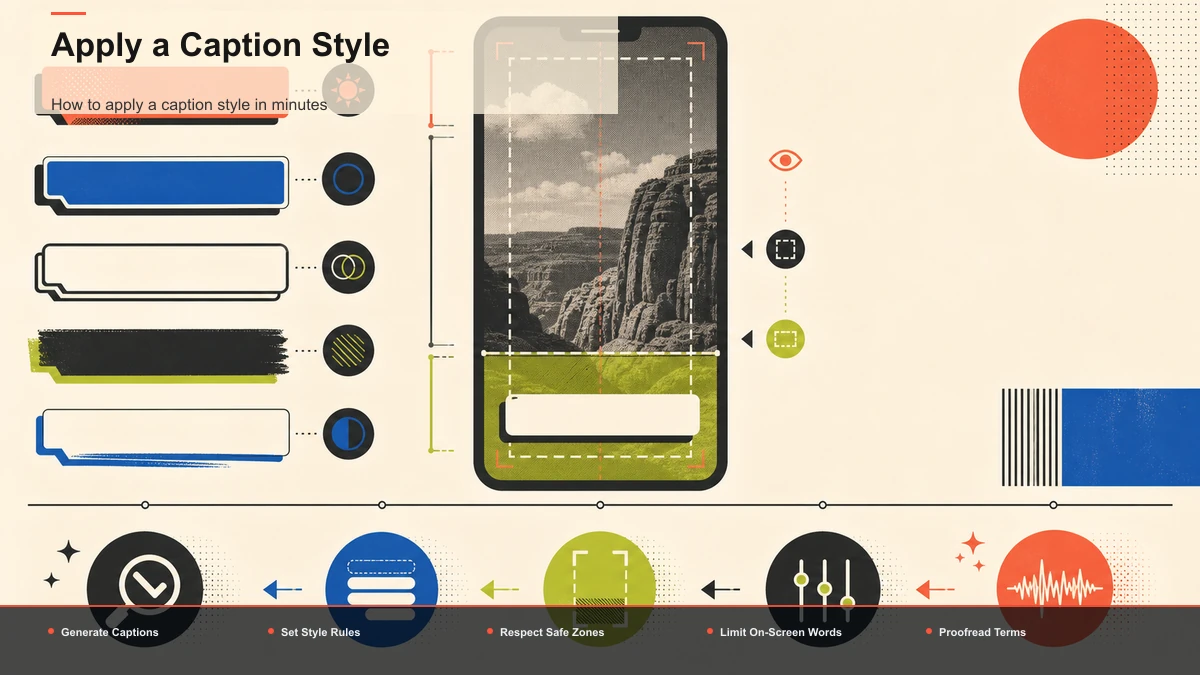
Knowing the recipe is half the job; applying it without hand-placing every line is the other half. The efficient path is to auto-generate accurate captions, then apply a saved style to all of them at once. Here's the workflow:
- Generate accurate captions first. Style means nothing over wrong words, so start from a clean transcript. Recapo's auto captions transcribe your clip and produce timed captions you can then style in bulk — accuracy before aesthetics. If you're starting from a raw file, our walkthrough on how to add subtitles to a video covers the full first pass.
- Set your levers once. Open the subtitle style editor and lock in font family, weight, fill color, outline, shadow, and any word-highlight — the exact defaults from the tables above. Save it as a preset so it's one click next time.
- Position inside the safe zone. Drop the caption block into the lower-middle band, clear of the top 10%, the bottom fifth, and the right action rail. Center-align so it clears the rail without manual insets.
- Cap the words on screen. Keep it to two to five words per line so the read matches the scroll; break long sentences into short beats rather than shrinking the font.
- Proofread names and jargon. Fix any misheard names, brands, or technical terms by hand — nothing undercuts a polished style like a wrong word.
- Preview muted on a phone. Watch the actual export on a real device with the sound off. If you can read every line at a glance over your busiest scene, ship it.
- Reuse the preset everywhere. For the next video, generate captions and apply the saved style in one step. If you'd rather start from footage than a transcript, the video caption generator runs the caption pass straight from your clip.
The point of this order is leverage: you make the taste decisions once, and every future video inherits them automatically — which is how creators keep a recognizable caption look across hundreds of clips without redoing the work.
Where Recapo fits
Most of this you can execute in any capable editor — the styles above are platform-agnostic on purpose. Recapo is worth a look if you want the whole caption pass in one browser tab: it runs in the browser with no install, transcribes and captions your clip, lets you style those captions and reframe to vertical, then export — so generating, styling, and positioning captions live in the same place instead of bouncing between apps.
Honestly and within its lane, for this job Recapo can:
- Transcribe and caption your clip so you're styling accurate, timed text.
- Style captions: font, weight, color, outline, and word-level highlighting via the subtitle editor.
- Resize and vertical reframing so the caption sits in the right safe zone for 9:16.
- Export a finished, captioned vertical clip for Shorts, Reels, and TikTok.
It accepts MP4, MOV, and other common formats, handles up to 6GB total per task, and keeps plans on the pricing page. Being clear about the boundary: Recapo styles and burns in captions, but a great style still can't rescue a boring clip or wrong words — you bring the footage and proofread the names. For a creator captioning several videos a week, the win is saving one style preset and reusing it, so the aesthetic decision in this article becomes a one-click default rather than a per-video chore.
FAQ
What is the best caption style for YouTube Shorts and TikTok? The consensus default is bold white sans-serif text with a thin dark outline, two to five words on screen at a time, centered in the lower-middle safe zone — optionally with subtle word-by-word highlighting for fast spoken content. It wins because it stays legible at a glance, muted, over any background. Start there, then express your brand through font choice and one highlight color rather than by weakening the readability fundamentals.
What is the best subtitle font for shorts? A bold sans-serif — geometric (Poppins, Montserrat) for a clean modern feel, neo-grotesque (Helvetica, Inter) for a neutral professional tone, or a condensed heavy display (Anton, Oswald) for loud hype edits. Avoid serif and script fonts; their thin strokes blur at phone size over moving footage. Whatever you pick, keep the weight bold or heavier and use one font per channel — weight and consistency matter more than the specific family.
What is the caption safe zone for vertical video? It's the region of a 9:16 frame that platform UI doesn't cover. As a conservative rule of thumb on a 1080×1920 canvas, keep captions out of the top ~10%, the bottom ~18–20%, and the right ~12% (the action rail), which leaves a centered band roughly between 50% and 78% of the height. These aren't official numbers and app UIs shift, so always preview on a real phone with the app open before you finalize.
How many words should be on screen at once? Two to five, or a single short phrase per beat. That matches how people read while scrolling and keeps the text large enough to catch at a glance. Longer lines force a smaller font and split the viewer's attention; break long sentences into short timed chunks instead of shrinking the text to fit.
Do word-by-word highlighted captions actually help retention? For dense, fast, spoken-word content they generally do — the moving highlight paces the read and keeps the eye locked on the text. For slow, atmospheric, or cinematic content they often hurt, reading as cheap and fighting the mood. Keep the highlight subtle (one accent color or a small scale bump), and test both versions on your own clip rather than assuming it always helps.
Standardize your caption style once
The fastest way to stop redeciding captions on every upload is to lock one readable style and reuse it — bold sans-serif, white fill, thin outline, two to five words, safe-zone position, and a highlight only if your content is fast. If you want to build and save that preset in one browser tab — auto-caption a clip, style it, reframe to vertical, and export for Shorts, Reels, and TikTok with nothing to install — create a free Recapo account, caption one real clip, and save your look as a reusable default. Do it once, and the aesthetic decision in this guide turns into a one-click habit for every video you post next.